A well-designed bathroom is more than just a collection of separate features. When each element, worktop, tiles, cabinets, and fixtures, is chosen with consideration, the result is a cohesive and comfortable space that feels both functional and timeless. One of the most important relationships in bathroom design is the way your worktop material and colour interact with the surrounding finishes.
Selecting a beautiful surface is only the beginning. Ensuring that it blends properly with the rest of the room takes a bit more planning, but the end result is always worth it. Whether you’re starting from scratch or working within an existing scheme, here’s how to confidently match your bathroom worktop with the other core elements of your space.
Start with either your worktop or tiles, but not both
It’s tempting to try to choose everything at once, but this often leads to visual clutter or last-minute compromises. A more innovative approach is to pick either your worktop or your tile as the starting point, then build the rest of the design around that choice.
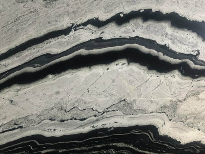
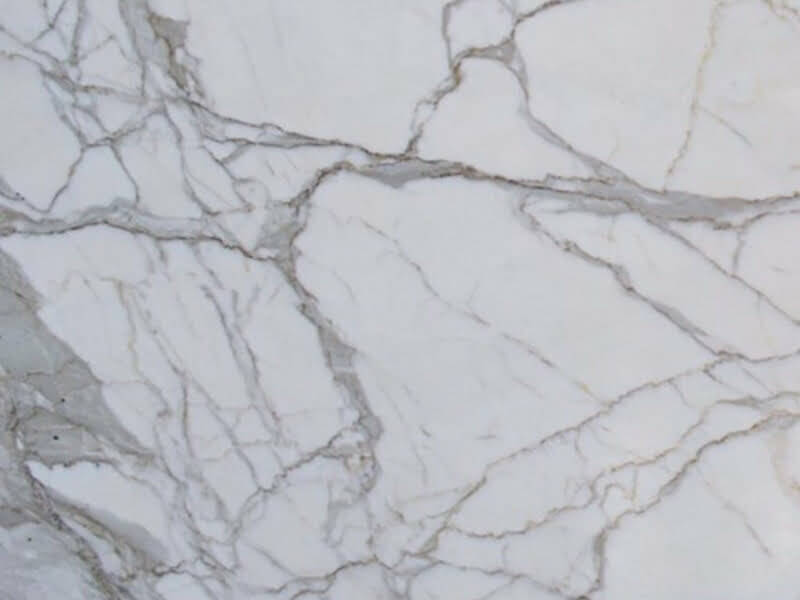
If your focus is on a dramatic quartz surface with bold veining, let that be the anchor and select simpler tiles to complement rather than compete. If, on the other hand, you’ve fallen in love with a patterned ceramic tile, a solid or softly marbled worktop will help calm the visual impact and bring balance to the room.
Trying to incorporate too many standout materials can make the bathroom feel disconnected. Limiting strong patterns to just one or two surfaces will allow the room to feel spacious and thoughtful.
Match the tone before the colour
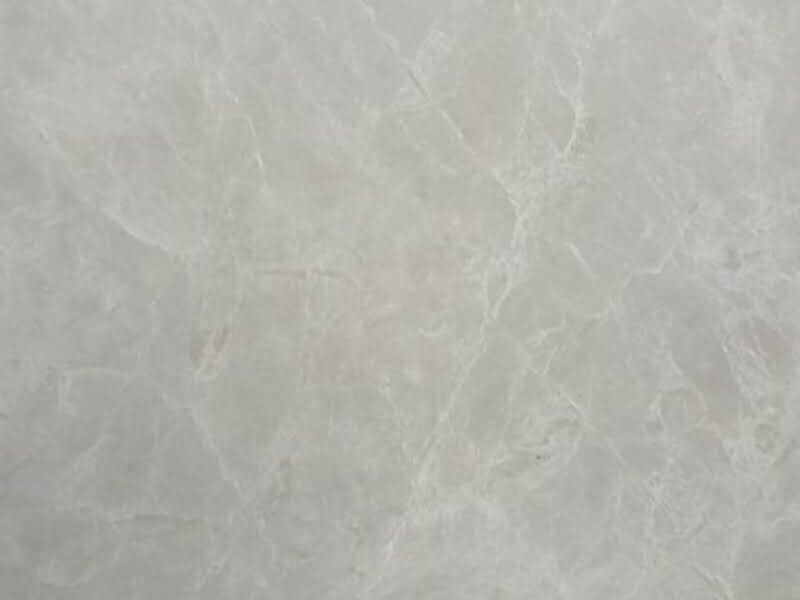
Rather than trying to match exact colours, focus first on tone. Is your chosen worktop warm, cool, or neutral? A cream quartz surface with subtle veining sits comfortably with warm greys, natural wood, or soft brushed brass. A crisp white quartz, on the other hand, pairs well with cooler tones, such as soft blue tiles or chrome fixtures.
Once the tone is established, you can play with contrast or similarity in colour. A high-contrast combination, like a charcoal surface with white cabinets, can look sharp and modern. A low-contrast palette with similar shades across the worktop, tiles, and cabinetry feels more relaxed and spa-like.
Avoid trying to match everything perfectly. Instead, aim for a complementary blend that lets each element play a supporting role in the overall aesthetic.
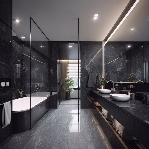
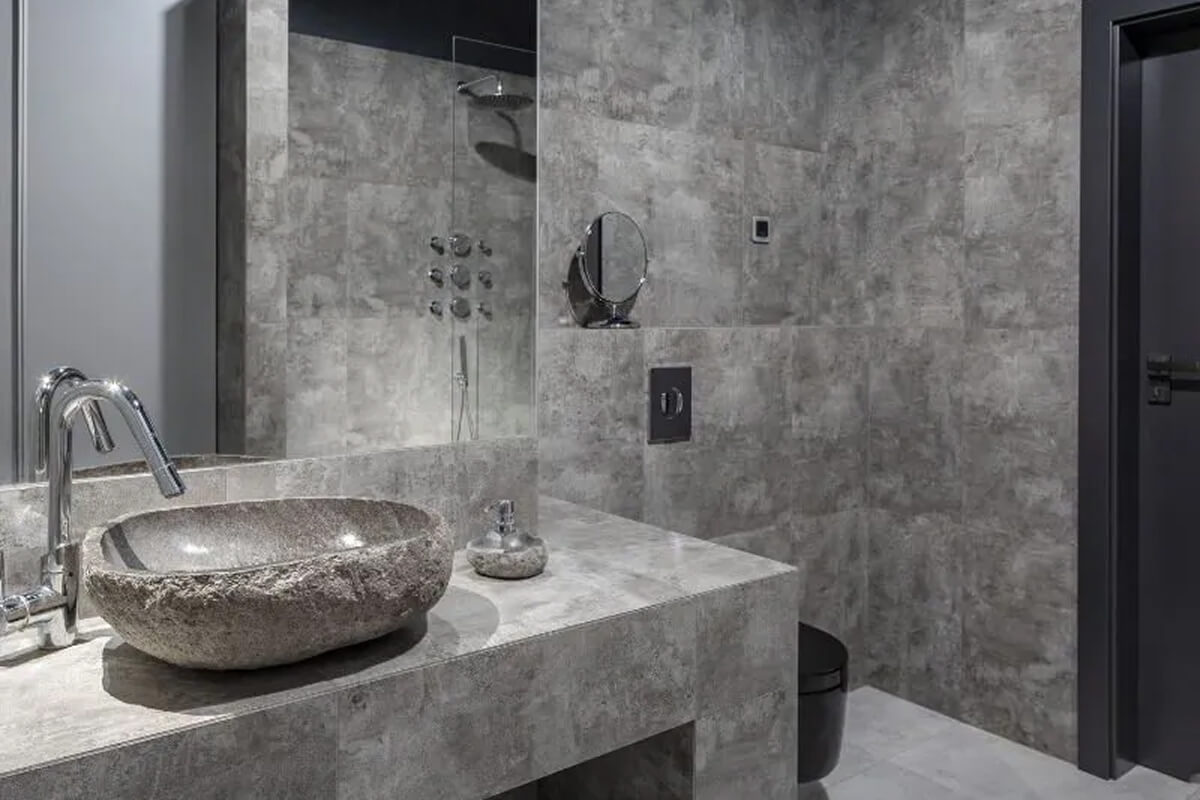
Pair natural-looking worktops with earthy textures
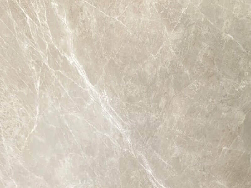
Quartz surfaces that mimic stone, marble, or concrete bring a natural element to the room. These are often best paired with tactile, matte finishes elsewhere in the space. Textured tiles, natural oak vanities, or brushed metal taps all complement worktops that feature soft veining or stone-like patterning.
This approach is efficient in Scandinavian or minimalist bathrooms, where layering subtle differences in texture can add richness without relying on colour. A grey quartz top with light speckling, pale clay tiles, and a fluted timber cabinet can create a sense of calm, grounding, and cohesion.
If your quartz surface features visual movement, such as swirling veins or speckled undertones, select quieter textures for the other surfaces to maintain a refined look.
Consider fixture finishes early
Too often, taps and hardware are selected at the end of a bathroom renovation, when budgets and decisions are already stretched. This can lead to mismatched finishes or materials that don’t quite complement each other.
Instead, consider your fixture finish while planning your worktop and cabinetry. A gold tap works beautifully with a warm beige quartz surface or cream-coloured cabinets. Black fixtures pair nicely with mid-grey or concrete-inspired quartz. Polished chrome is more forgiving, but it has a cooler tone that may not complement pink- or yellow-based surfaces as well.
If you’re including a statement mirror, wall light, or towel rail in a metallic finish, check how that colour reads next to your worktop and tile samples under different lighting conditions. Often, samples viewed in daylight will feel completely different in a windowless bathroom with LED spots.
Use cabinetry to link your surface and wall colour
Cabinetry can serve as a visual bridge between your worktop and the walls or tiles. If your quartz surface is pale with grey or taupe undertones, try a mid-tone cabinet in sage, walnut or slate to ground the space and introduce softness.
Painted cabinets offer flexibility. They can be colour-matched to a specific shade within your quartz pattern or chosen to echo your tile grout or floor tone subtly. Timber cabinetry adds warmth and depth to otherwise monochrome schemes, and it pairs well with both plain and veined surfaces.
Avoid matching your cabinet colour exactly to the worktop. A slight difference in hue or material finish helps define each element, bringing dimension to the design.
Think about lighting and reflection.
Both natural and artificial lighting will influence the appearance of your bathroom surfaces. If your bathroom receives a lot of daylight, polished surfaces like gloss quartz will reflect light and appear bright. In lower-light spaces, a matte or honed finish can reduce glare and provide a softer, more subdued look.
Consider also how the light interacts with your tiles and tapware. If you’ve chosen a worktop with subtle sparkle or reflective flecks, make sure the lighting plan includes both task and ambient options to bring out those qualities without over-illuminating the space.
Under-cabinet lighting can highlight the surface material, while dimmable wall sconces help soften the transition between tiles, mirrors, and worktops.
Avoid mixing too many surface types
With so many materials available, it’s easy to get carried away. However, using too many different finishes in a small room like a bathroom can make the space feel disjointed. If you’ve chosen a stone-effect quartz for the vanity, consider continuing that surface onto a small splashback or niche shelf for cohesion. If you have natural stone floor tiles, pairing them with a plain quartz surface can help reduce visual competition. Conversely, if your floor is simple, using a patterned or veined worktop adds interest at eye level without making the room feel heavy. Three or four finishes in total, worktop, tile, cabinet, and fixtures, are often enough to give the space variation without losing unity.
Sample everything together before committing
Before finalising your materials, place samples of your worktop, cabinet door, tile, and fixture finish together on a neutral surface. This will help you notice whether the tones feel harmonious or if one item seems out of place.
Be sure to view them in your bathroom’s actual light, not just showroom lighting. Take note of how the colours change during the day, especially if your bathroom has a window or skylight.
Some of the most well-balanced bathrooms are the result of a few simple samples placed side by side and adjusted slightly before the final choice was made.
Order a Sample
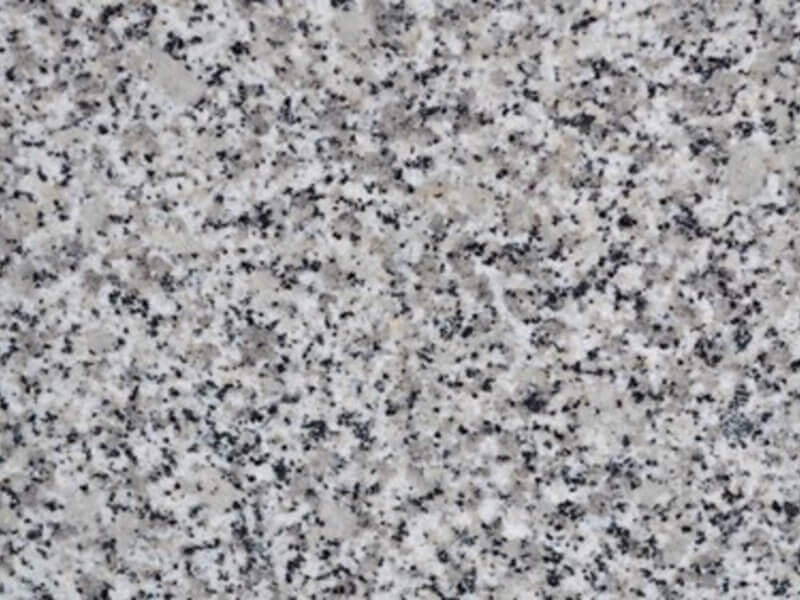
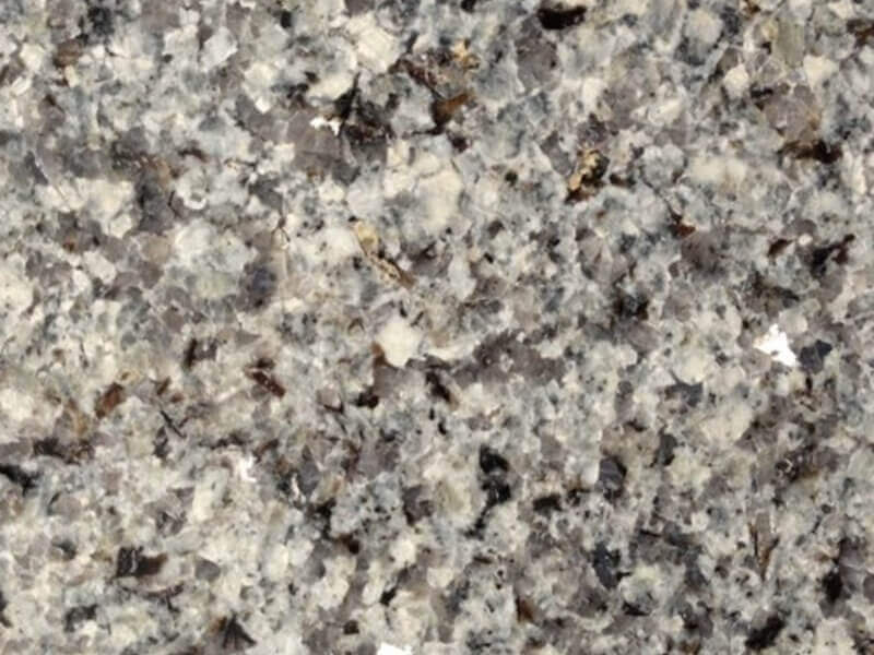
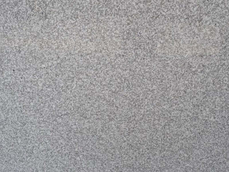
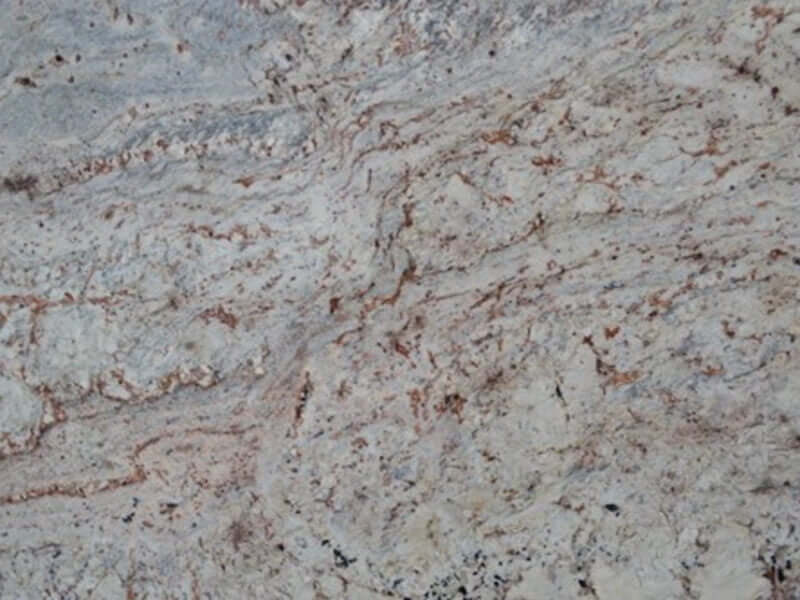
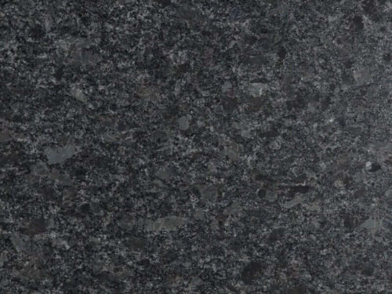
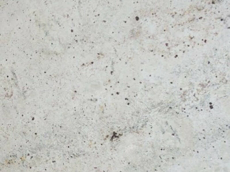
We offer a range of Quartz samples that we can send out to you along with arranging slab viewings for Quartz, Marble, Granite and Quartzite.
A beautifully designed bathroom isn’t defined by one standout feature, but by how well the elements work together. Matching your worktop with your tiles, cabinets and fixtures takes a little extra thought, but it can completely change how the room feels once finished.
By focusing on tone before colour, coordinating finishes, and testing samples in real light, you’ll be able to create a bathroom that feels both personal and timeless.
For those planning a bathroom update, TOPSCO offers an extensive collection of quartz worktops in tones and textures that pair effortlessly with today’s most popular tile and cabinet styles. Get in touch to order samples or request a quote for your bathroom project.